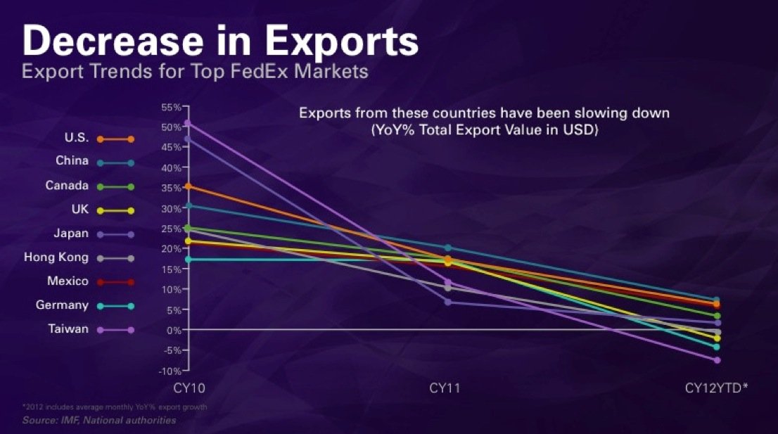
This chart is from a speech given by FedEx CEO Fred Smith at an investor dinner last night (via @CEP_Observer).
See: FedEx Global Trade Slowdown in one gigantic chart
Follow
____________________________
Cory’s Chart Corner
____________________________
Danielle’s Book
Media Reviews
“An explosive critique about the investment industry: provocative and well worth reading.”
Financial Post“Juggling Dynamite, #1 pick for best new books about money and markets.”
Money Sense“Park manages to not only explain finances well for the average person, she also manages to entertain and educate while cutting through the clutter of information she knows every investor faces.”
Toronto SunSubscribe
This Month
Archives
Log In


Let’s be objective. I’m not even sure I understand that chart. Is is showing growth rates? I’m not sure. If it’s showing growth rates, then growth has slowed over the reference time frame, growth rates for about half of the sampled are still positive. I’m not saying this is good, but the chart could easily be misconstrued to show that exports are shrinking, when in fact for half the countries exports are still expanding, just at a slower rate (much slower in some cases).
(I had the same issue with an article by Ellen Brown who tried to show that money supply was shrinking using a chart of M3. But in fact, it was not that M3 was shrinking, but the growth rate was slowing. I had to point this out to her, which all but refuted her entire point that M3 was deflating. So we must be careful.)
Getting back to the chart: First of all, the sample size is small, even though it does include many of the world’s largest economies, there are many large economies not shown, so it does not give a complete picture of world export trends. Second, it uses only three data points over almost three years to create a trend line. This gives only a very rough picture of the trend. You can plot the same data on two charts, but if one chart uses a very different time interval they can look very different, even the trend can be different.