
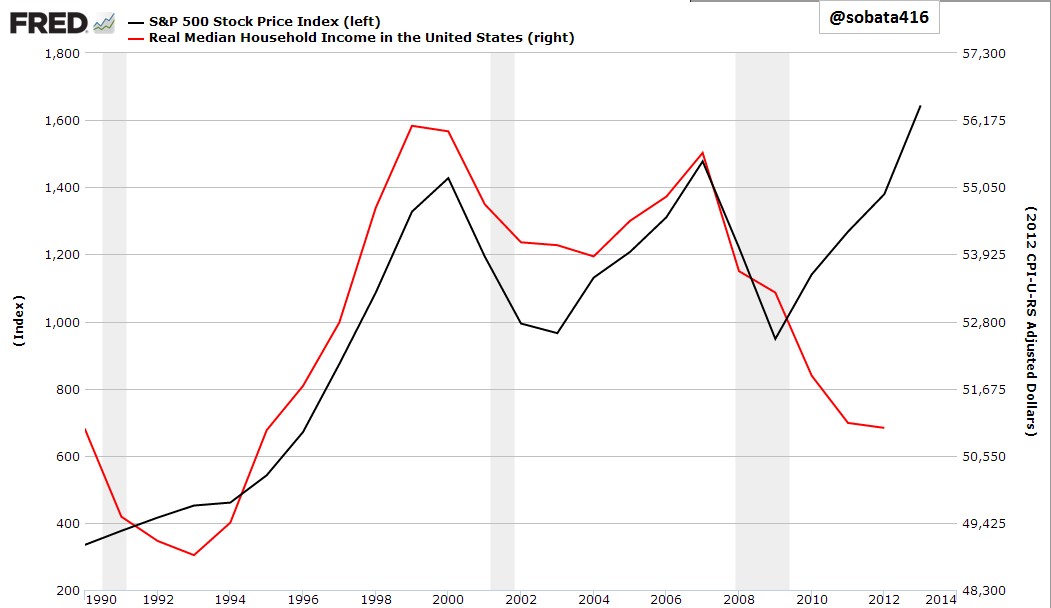
Surfing life savings over QE/HFT waves today may seem smart and proactive. But then again its also a fool’s paradise. Like Robert Redford’s character in All is Lost, equity market participants today are wading around on a sinking boat that can plunge at any moment. This chart capturing the glaring disconnect between US household incomes and the S&P over the past 4 years, as compared to the tight correlation 1990 to 2010, offers insight. A 50% fall in the S&P 500 would close the gap and restore historic correlations.
Follow


____________________________
Cory’s Chart Corner
