A big wave of risk selling this week is hitting equities, commodities, gold and the Canadian dollar hard while capital has surged into bonds and the US dollar. The below risk-trade barometer captures these moves in a useful historical context.
 Source: Cory Venable, CMT, Cory Venable, Venable Park Investment Counsel Inc.
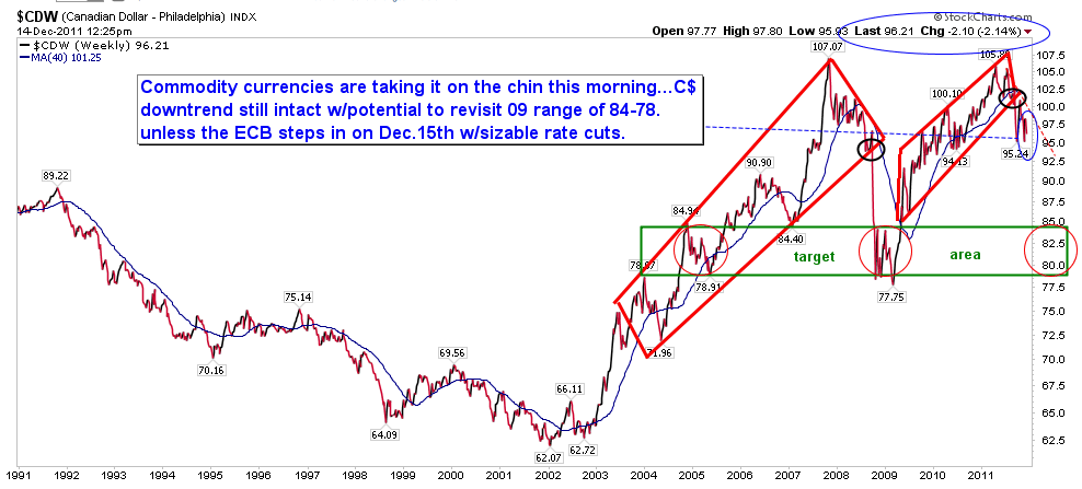
Here is the Canadian dollar index on its own, showing a downside test potential some 16% lower than present levels at the 2009 78 to 84 range for this index. No doubt there will be lots of violent swings in between, even if the dominant price trend continues to move lower.
 Source: Cory Venable, CMT, Cory Venable, Venable Park Investment Counsel Inc.


How does the blue line get calculated in the first chart above? Is there a charting function that creates the %s on the right side?
From Cory:
David it’s a 20 week exponential moving average of the ratio. The % is a chart preference in the price style dialogue box. C
Thanks for the great chart. We have Danielle on the fundamental analysis side and yourself on the technical analysis portion. If you could find somebody to fugure out how to chart the biggest factor, criminal analysis, you would be off to the races.
Happy to be of service…C.