Short-seller Jim Chanos updates on the end of the commodities super cycle and the risk of presently jubilant stock prices for investors. He spoke with Reuters today. Here is a direct video link.
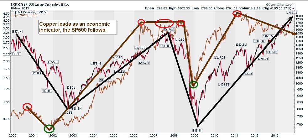
This long-term chart of the price of copper–gold line (think real economy) versus the price level of the S&P 500 –black line (financial markets) over the past 13 years pretty vividly underlines the unusual disconnect presently between the real economy/demand and QE juiced stock prices. Sustainable? Never has been. This time different?

Chart source: Cory Venable, CMT, Venable Park Investment Counsel Inc.
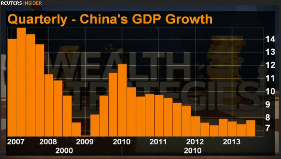
The fact that the price of copper has been falling along with global growth again since 2011 makes rational sense. High prices from the commodities bubble spurred record global production and stockpiling of copper inventories which have been very slowly drawing down over the past 2 years as rampant production has been slow to shut down even while demand has plunged with Chinese growth as shown in this chart.


