The longer/further price gains go above the long term average (5% a year line below) the longer/further they will spend laboring beneath it. Moonshots like the past year over year move in Toronto prices, is a 4 standard deviation event above the long term mean, and that’s a bad sign. This chart since 1990, offers some insight on scope and scale. The payback period after this one, is set up to be long and hard, potentially unprecedented.

Unfortunately madness and mayhem is not “contained” to Toronto. The ‘average’ Canadian home price nationally is now about $613k or nearly 8 x the average national household income–the long term multiple generally considered healthy/affordable/sane is 3x household income. Froot Loops anyone?
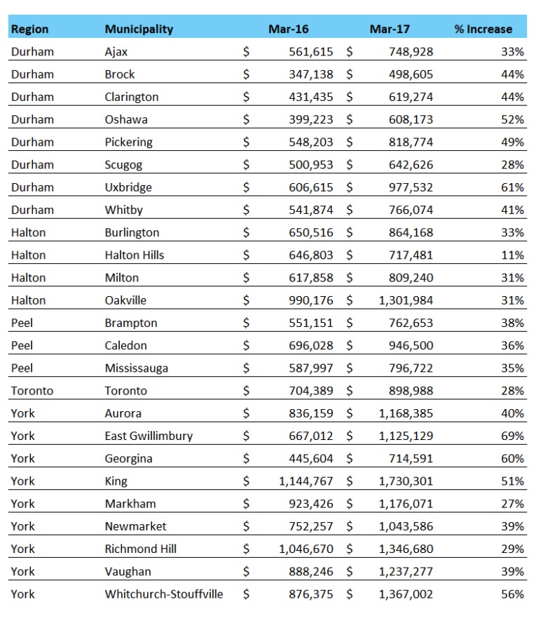
For many, the dream of home ownership has become a nightmare of extreme indebtedness and insufficient cash flow to cover living expenses never mind savings for the future. The resulting deficits will be a problem for families, businesses, social programs and taxpayers across the country. Read the below table of gains over just the past year, and weep. Much pain and suffering lies ahead when our debt-addicted nation goes into rehab once more. See: Home price surges across the GTA in March.


