Years of undisciplined monetary and fiscal policy have enabled the worst financial habits and highest debt abuse the world has ever known, and the payback period is now weighing on the world economy and asset prices.
International Monetary Fund executives are warning that the world is unprepared for the slowdown, and yet it’s here all the same–because reckless behaviours have earned it.
The US central bank has tightened its policy rate 900% in the last three years, but at just 2.5% today it meets this cyclical downturn with less than half its historical rate-cutting room on hand. Also, central bank balance sheets globally have already swapped cash reserves for trillions in assets purchased to prop up prices over the past eight years.
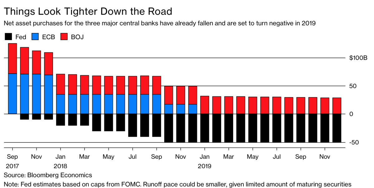
While the US Fed, ECB and Bank of Japan were collectively buying well over $100 billion in assets a month a year ago, now they withdrawing about $50 billion from global markets monthly as shown below. See: Stock market investors, it’s time to hear the ugly truth.
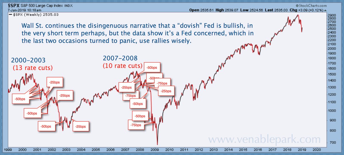
For those those who believe that central banks remain all-powerful and that a switch back to looser policies in the months ahead will be enough to stop asset prices from deflating, my partner Cory Venable offers the below chart of the S&P 500 since 1999 (20 years of the most notorious ‘easy money’ in history). He notes that while rate cuts start when stock markets decline, they do not prevent the losses.
Even when the US Fed slashed more than 5% off policy rates in the last two declines (compared with the minuscule room they have today), stocks lost 50%+. Bear markets typically bottom months after rate-cutting cycles have been in process for several quarters, and so far, this cycle, central banks are still in a self-proclaimed hiking mode.
It is important not to lose the plot here: economic downturns start because demand cycles are driven by credit and credit expansions cannot continue indefinitely any more than trees can grow into outer space. Market bottoms come not because rates are suddenly lower, but because sentiment that was far too optimistic at the top becomes far too pessimistic near the bottom and asset prices finally fall to levels that attract prudent cash investors once more.
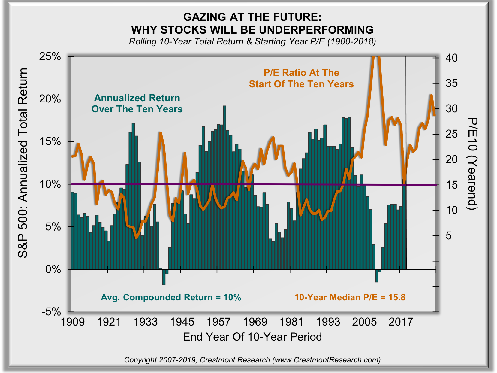
It is also critical to understand that as shown in the chart below from Ed Easterling at Crestmont Research, the very few times that stocks have been so dramatically over-valued as today (orange line below) the total annualized returns (including dividends) from those levels were negative for a decade after that (in green). See Serious Implications: forecast skew over the next decade and Gazing at the future:
The starting valuation matters! When P/Es start at relatively lower levels, higher returns follow — paying less yields more. When investors have P/Es that start higher, subsequent returns are lower. This graphical analysis presets the compounded returns that follow over the subsequent ten years based upon the starting P/E ratio. It’s compelling, primarily because it’s fundamental — starting valuations directly impact subsequent returns. From the current above-average valuations, below-average returns are likely to follow for the next decade or longer.
Those who manage their exposure to minimize the correction/loss cycles and preserve liquidity to deploy cash after prices have mean-reverted, on the other hand, can buy in at the best yield and return prospects in decades.
What we decide to do in response to present facts will impact our financial progress for years to come. None of us are helpless, wise choices are ours to make.

