While some wait breathlessly for self-enriching US Fed members to hold forth on their nex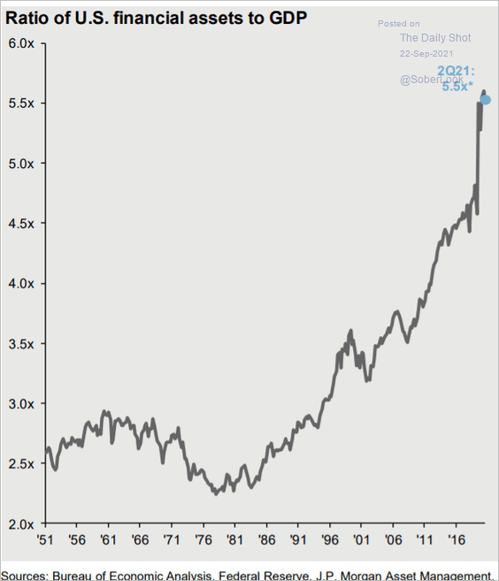 t policy tricks, this chart shows the relative size of US financial assets at 5.5x US gross domestic product today compared with 3.5x at the tech bubble top in 2000, and less than 3x from 1950 through the mid-1990s.
Looks about as healthy and sustainable as Canadian home transfer costs, now making up a whopping 10% of Canadian GDP (as shown earlier this week.)
As stocks rebound from some of this week’s losses this morning, under the hood weakness has been broad, with just 31% of S&P 500 members trading above their 50-day moving average as of yesterday’s close (shown lower left). 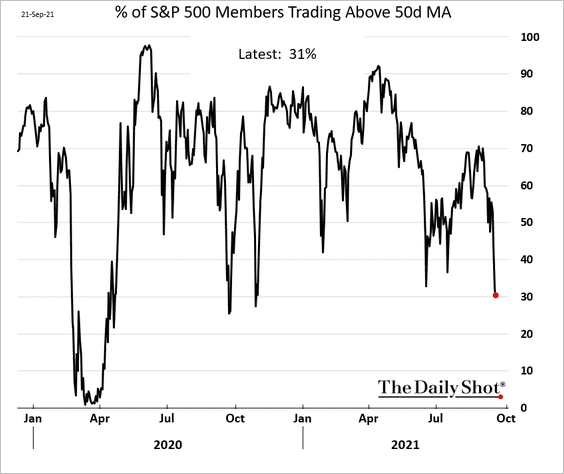
Meanwhile, the US dollar index (DXY) is so far holding above $93, and long government bonds remain bid in a slowing global economy that is long on debt and increasingly short on cash.
With the consensus expecting a reduction in central bank largesse over the next 6 months, the question is where new inflows will come from to keep asset prices moving higher? Stagnation is not an option here. With the retail crowd now fully in and then some (on margin), which weak hands are left to buy?