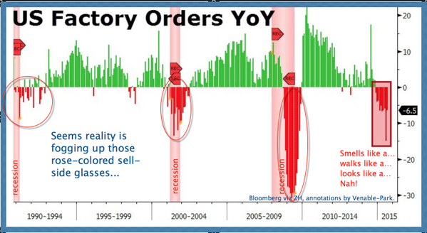
While sell-side automatons explain why this morning’s big miss in payrolls is no big deal and the economic expansion (already one of the longest–although weakest–in history) is about to accelerate every day now, we offer a couple of big picture charts for sober consideration. US factory orders here since 1990, comparing the downturn year to date (far right) with readings over the last 3 business cycles.
And this one of US and German 10 year government bond yields over the past 6 years.

Tightly correlated for many years, the yields of both countries rejected inflationary expectations since 2011 and fell throughout economic ‘recovery’. After a short rebound when the US Fed rolled out QE3 experiments in 2012 (blue dot), yields resumed their downward trend in 2013.
Yawning at the inflation forecasts of bankers everywhere, the bond market continues to price for further economic weakness and deflationary pressures ahead. With the US 10-year breaking below 2% again this morning, US yields still have significant downside if they are to rejoin Germany’s in the months ahead. How low can they go? Commodity prices are answering: a lot lower for longer than most imagine possible.


