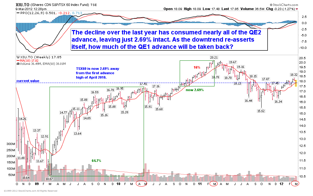
With the extreme swings we have lived through over the past couple of years it can be difficult to get a cogent view. Sort of like holding a printed page at the end of your nose–you can see writing but you can’t grasp the point. This chart of the past 4 years in the TSX 60 (XIU) offers some clarity.
We can clearly see that the bulk of the cyclical rally off the ’09 lows came freakishly fast in 14 months, with a 65% gain from March 2009 to May 2010 on massive global fiscal and monetary stimulus. After that the market faltered listless for six months before breaking into another 16% up-leg on the next round of monetary juice via QE2 from November 2010 to April 2011. Since then amid all the noise of hype and hope, the TSX has faltered again, giving back to date, nearly all of the QE2 rally over the past year. Where to next oh fearless leader?

Source: Cory Venable, CMT, Venable Park Investment Counsel Inc.


Cory, this chart is a very good and clear example of how you can successfully trade an index with only a pencil and a ruler. You could use options to minimize risk. Keep it simple.
Bulls and BlackRock think p/e’s are “fair”.
Prof Shiller and his CAPE metric beg to differ – and I’ll stick with an assessment from one who doesn’t have a vested interest in getting me to buy.
I agree…similar to the concept that many diets can be successful if adhered to…
C.
Your MACD chart makes it look like this lame rally will continue for another 3-4 months. After that, the Portuguese will show up wanting a bailout, closely followed by the Greeks looking for second helpings.
Hi Cory,
I use the 10 week SMA and its slope to inform adding risk and the 40 week EMA and its slope to reduce risk. I wonder what you think about this.
The 40 week EMA gave a sell signal last week (there was a sell in June 2011 as well – and one might have been in the market since Jan this year for a trade).
I do not use the moving average crosses but pay attention to where the 10 and 40 are relative to each other. I saw your chart above when I was in the middle of an analysis of asset class strength (large and small cap, international indexes, REITs and different bonds) based on these criteria.
I also use some fundamental indicators, primarily credit spreads and the price of commodities and NIPA corporate profits with inventory valuation adjustments. I do not pay attention to p/e’s except with reference to long run value such as CAPE. I also look at Q.
These signals are indicating an overvalued market without momentum. I see fragility and a lack of robustness that makes vulnerability to shocks higher. So combined together I will be reducing risk considerably at this point.
As long as your system is objective vs. subjective and you maintain tenacious discipline about your rule set you should be fine. The concern about slopes on trendlines are they may get a bit too subjective unless you have a protractor at-hand and use the same time and scale window to detect your signals from. Good Luck! C.