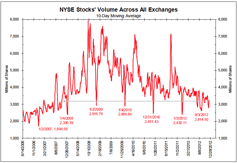
This chart of stock volumes captures so much of the risk that keeps us up at night regarding equity markets today. Although long-always investment types have been recommending stock allocations throughout the duration of this chart, rational risk-assessing investors have increasingly moved to the sidelines over the past 4 years. Market prices that are built on a few leveraged-hyper-trading-participants are inherently unstable and full of great capital risk.
See: NYSE Volume chart deceptively informative
Consider what the overall falling volume trend means:
• The financial services industry is shrinking;
• Commissions are falling
• Stock picking is being replaced with ETFs;
• Psychology is negative, as Main St is not participating and Mom & Pop have left;
• Active trading is being replaced with passive indexing;
• HFT Algos may spoof millions of phony bids, but they are having a harder time getting executed.


Do not fight the FED!!! Money being pumped out around the world will find its home in assets. Gold, stocks, etc are going up until the Fed is done.