Jonestrading Chief Market Strategist Michael O’Rourke discusses his outlook for the markets. Here is a direct video link.
This chart of the S&P 500 since 1996 goes well with this discussion.
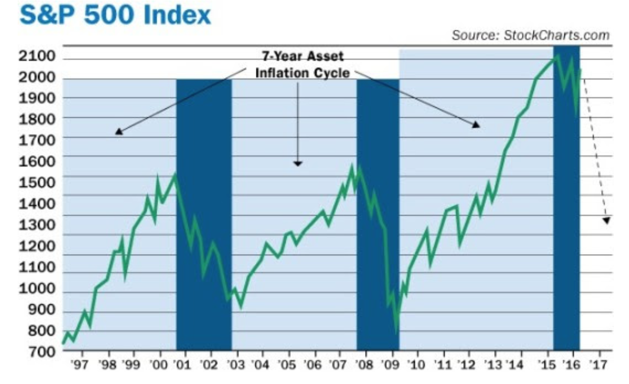
Chart source: David Stockman
As does this one of US Profits (blue line) and business investment (yellow) over the same time frame. Note how the stock market has lagged the profit cycle throughout. A year over year profit decline of 10% (as seen since 2015) has marked the onset of previous recessions in both 2001 and 2008 even as delirious stock prices (above) were topping out.

Chart source: CNBC