The chart below shows the factors which have driven price gains in the S&P 500 stock index over the last decade, since 2011. The breakdown should concern thinking people.
A full 40.4% of price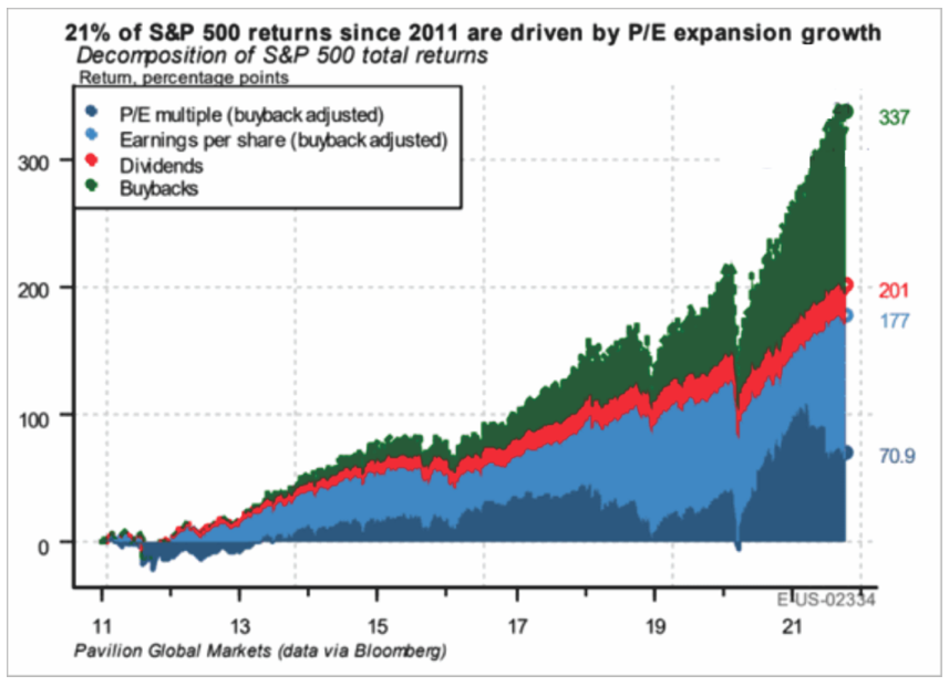 gains (in green) have come from companies buying back their shares (something considered illegal market manipulation up until 1982). Another 21% (dark blue) has come from buyers paying a higher multiple for the same dollar of earnings. Just 7.1% (in red) has come from dividend increases and 31.5% (light blue) from a rise in profits.
In other words, in the absence of share repurchases, the S&P would now be closer to 2700 than 4600 and have averaged a total of about 3% annually (before any fees) since the last cycle highs in October 2007–14 years ago. Lance Roberts offers further context here:
“Before you scoff at a 3% annualized return, such equates to an economy growing at 2% with a 1-2% dividend yield. Moreover, that calculation aligns with historical norms going back to 1900.”
Through this latest epic episode of inflated valuations and capital risk, most individuals and even pensions have fared worse than the headline indices because of real-world factors like price volatility, fear, greed, fees, income and capital withdrawals needed along the way.
And here’s a pro tip: like individuals, corporations that indiscriminately funnel their cash into corporate securities during bull markets are typically left weaker in the long run because they do so at the expense of productive and lasting investment in their operations and financial stability. They buy most near cycle tops and least near cycle bottoms when investment opportunities are most valuable because they come into bear markets and recessions short on cash and long on risk.
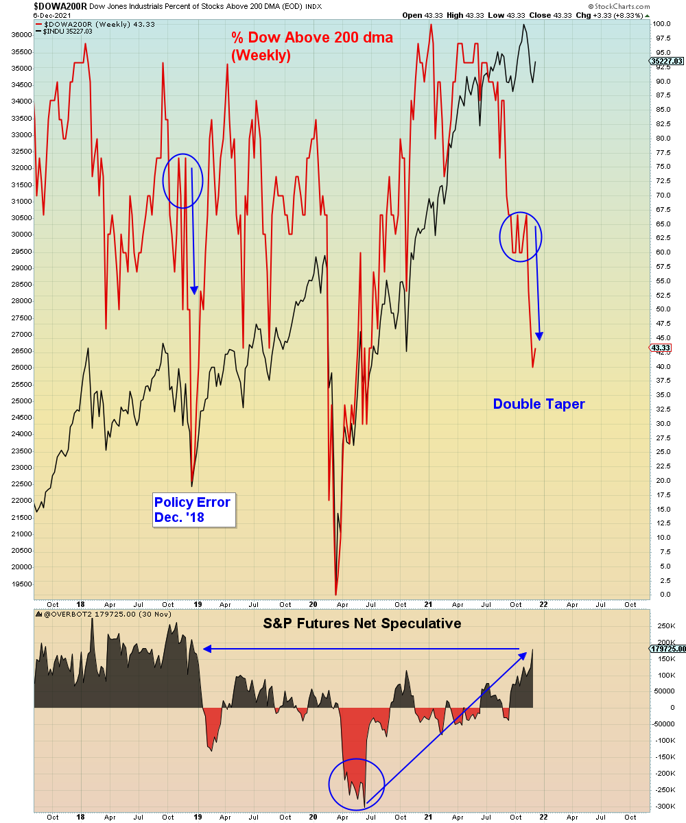
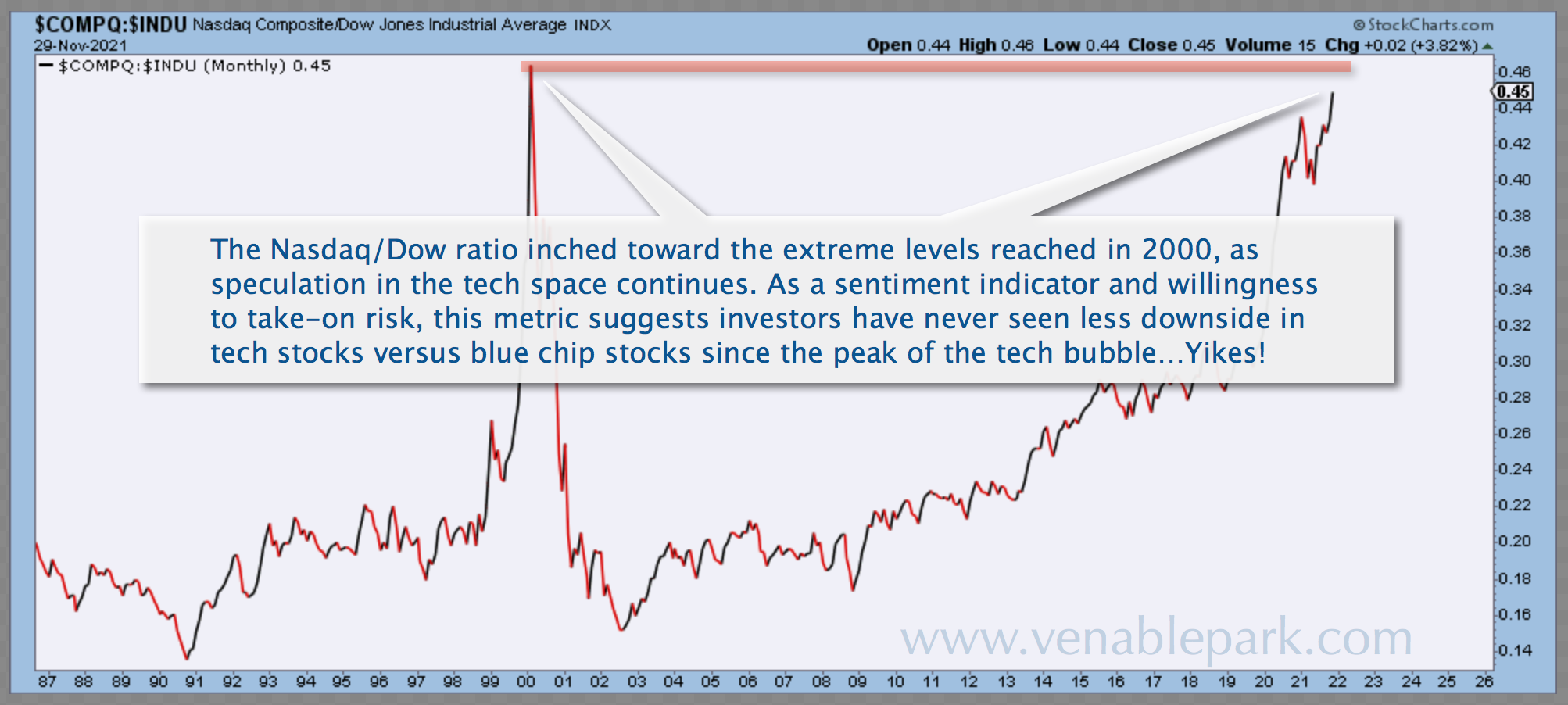
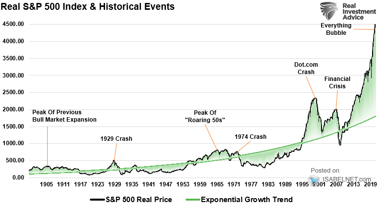
The other major issue is that valuations are now in the 100th percentile of historical occurrences–a zone that has always ended in multi-quarter loss cycles of 50%+, that wiped out many complete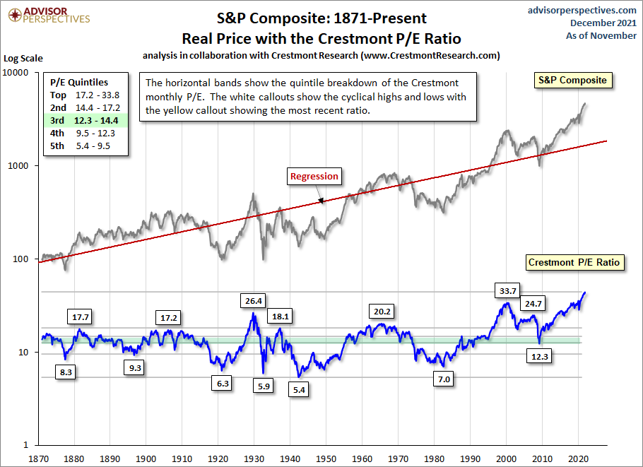 ly and took years for even the survivors to recover.
This chart shows the S&P 5oo price (in black) since 1870, its long-term trend (red line), as well as the historically informative Crestmont monthly price to earnings ratio (in blue)–today at 43.9, 198% above its long-term mean. Above every other secular peak from which deep, protracted bear markets followed.
Those who lack the ability or willingness to lose capital and wait years hoping to recover have no business owning stocks and corporate debt (including funds and ETFs of them) today; and yet, individuals, asset managers and speculators have never been more fully allocated. This is a recipe for years of financial regret.