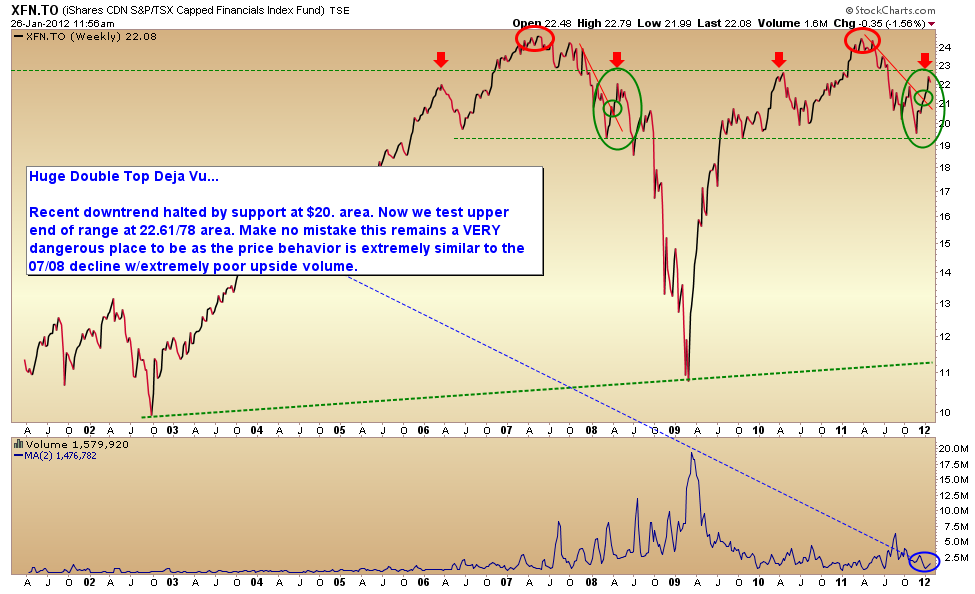
This chart of the Canadian bank sector (XFN) is one of the many that we are tracking carefully at present for signs of what comes next in the credit crisis fiasco phase 3.
As we look at the first peak in the banks marked in early 2007, one can’t help but note that global GDP was about 5% back then. It is likely to be about half that in 2012. Consumers had less debt, and governments were much less indebted. Yet shares of Canadian banks are back hovering around credit bubble highs today. I am worried about the regular folks who have been pushed into the banks for “safe yield” the last couple of years. When the levered traders pile out again, mom and pop are likely to be hurt just as badly this time as they were in 2002 and 2008. No doubt oblivious advisors will be surprised yet again by the losses.

Source: Cory Venable, CMT, Cory Venable Investment Counsel Inc.


FWIW: I keep a trading log as per suggestion of Joe Granville. From the swearing in of Ben Bernanke in Feb 2006 the Dow was at 10,793, crude oil 65.37, gold was 571, silver was 9.76 and an article from Investors Bus Daily “Home Equity Extraction Still Hot…but if housing cools off with sales and prices slipping at the end of 2005, will the nations favorite piggybank finally start to crack?”
Its amazing that the papers ‘got it’ before the new Fed Chairman did. Could not any fool see the writing on the wall? And we all know the aftermath.
Right on Danielle – CIBC + RBC are already ‘dead’ – and TD bought 18 Billion worth of Italian Bonds… without even looking at the derivatives contagion- presume that MF Global will not be a unique situation. Bank Holidays are nigh… listen to Tavakoli, Ann Barnhardt, Jim Willie… there is no rule of law in the financial system anymore. As Kyle bass states – why would you want to be in paper – when they are printing it faster than toilet paper (tripling M1)? Trouble is finding assets that are not denominated in paper – hmmm….. I can name a couple…
I’m sure you have seen this……
http://www.sprott.com/media/34041/MAAG-11-2009-Dont-Bank-on-the-Banks.pdf
To Sprott’s credit the report written in November 2009 called for the meltdown of Dexia SA with leverage ratio of 116:1. Well that ship has sailed with very little notice from the general public. Canadian banks levered at 31:1 would only have to suffer a five percent decline in equity in order to wipe out common shareholders. Yes, Canada has a superior banking system!
Interesting George Soros fund purchased two billion of Italian bonds from MF Global.
http://www.youtube.com/watch?v=lmRBpeGgX-M
What happens when Italian bond hit 10%. I think we are about to see a blood bath in the sovereign bond market.
Apple shares are displaying classic bubble formation long term charts indicate parabolic chart since 2009. When these correct they correct hard at least 50 percent and fast. What for break of long term trendline.Wait for a definitive break and sell or short when it happens. No way it will continue to this.
I would keep a real close eye on apple I think its the old canary in the coal mine. When it cracks the markets will follow. And I sense we are close to blow off top in apple.
Here are AAPL’s earnings record per share adj for splits:
2005 1.42
2006 2.27
2007 3.93
2008 6.78
2009 9.08
2010 15.15
2011 27.68
2012 35.39 est revised to 41.37
2013 39.59 est revised to 46.16
PE: 13
Late stage base: 4 with a 426.70 pivot.
Base of 57 days before gap up, 15% depth.
I do agree the accum/dist grade is very poor at D-. Maybe some selling into strength to book some profits, but remember….there are new investors coming along with new money….who don’t believe all the low-hanging aaples have all been picked.
Like all my trades, I don’t care to predict, just watch…observe the chart.
I’m sure some will feel its over and sell in this new calendar year, esp in tax-deferred accounts. But parabolic? Parabola not evident. Short-term climax action maybe. It sure is white hot and all over the media though.
FWIW. Have a nice, safe and wonderful weekend everyone.
I like bank stocks, but no longer buy and hold instead I trade in a very short term cycle. I noticed a year ago a trading range had formed on the one I held. I also observed that on each short term cycle the highs are slightly less than the previous high and the lows are a little lower. A definite downward trend.
Don’t agree. As i stated look at a long term chart. It is the very definition of parabolic (long term chart with a sustained rise >45 degrees, much higher in apples case). I will repeat apple is a great company and probably won,t completely collapse but their stock chart will correct and likely at least 30 to 50 percent. A long term trend line break will signal this. When or why that happens nobody knows.